A breakdown of luxury labels and their identifying colours
High fashion palette
When it comes to establishing a designer label, building a strong brand identity that stays in the consumers’ minds is vital. A memorable brand image helps in making a name stand out among the sea of designers that are available in the market. After all, sometimes it’s not just about the design and quality of your product; you’re also selling the brand value that comes with each piece. For instance, designer brands not only captivate customers with their unique designs, but they are also a representation of a higher social status, in turn boosting the confidence of their wearers.
From creative elements such as patterns to muses, designers, and creative directors, one of the most apparent aspects—apart from the logo—is a brand’s signature colour. With that being said, let’s take a look at all the luxury fashion houses today and their emblematic shades.
Cartier Red
View this post on Instagram
Founded in 1847, Cartier has earned its reputation as one of the ultimate luxury brands to covet, loved by royalty and celebrities alike. However, it wasn’t until the 1920s and 1930s that the vibrant yet deep Cartier red became an important part of the brand’s identity, serving as a symbol of love. Even without the exquisite jewellery it holds, the Cartier box remains a popular collectable for enthusiasts!
Hermès Orange
View this post on Instagram
Did you know that Hermès actually started out using cream-coloured boxes at first? Hard to believe, but Émile-Maurice Hermès only picked orange boxes and brown ribbons simply because it was the only alternative left when they faced a shortage of box supplies during the Second World War. The appearance of the Orange H could be traced back to the year 1942.
Fendi Yellow
View this post on Instagram
The signature Fendi yellow was introduced in 1933 when the brand introduced its ‘Pergamena’ collection. However, the Italian label identifies three primary colours as its symbol—black, white and yellow. Yellow is said to be representing joy and optimism, while black signifies dominance and elegance.
Burberry Beige
View this post on Instagram
When we think about Burberry, the signature check pattern of beige, black and red immediately comes to mind. Although the house has not officially announced its signature colour, former Creative Director Riccardo Tisci has mentioned that the colour beige is synonymous with the British fashion label when previously debuting a Burberry campaign in 2019.
Tiffany Blue
View this post on Instagram
Now, who doesn’t know the famous little blue box? The story behind the distinct shade of turquoise started in 1845 when jeweller and founder of Tiffany & Co, Charles Lewis Tiffany, picked the sweet pastel tone of Robin Egg blue for the brand’s packaging. However, it wasn’t until 1998 that this New York-based jewellery brand got its colour patented. The House then standardised this custom colour that was remade by Pantone in 2001 as a shade made only for Tiffany & Co.
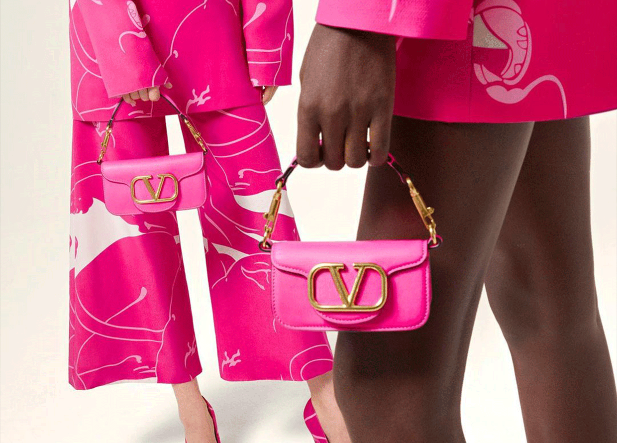
Valentino Pink
View this post on Instagram
Valentino, which has been synonymous with the colour red since 2003, recently introduced a new House code in the form of a vibrant pink hue during its AW22 ready-to-wear collection on September 15, 2022. This unique shade, named Pink PP, emerged from a collaboration between creative director Pierpaolo Piccioli and Pantone.
Bottega Green
View this post on Instagram
The Bottega Veneta green has risen as one of the most coveted colours among fashionistas in 2021, under the influence of former Creative Director Daniel Lee. Now that the house is placed under the reigns of a new lead creative, Matthieu Blazy, the extent to which this distinctive hue will persist in the brand’s aesthetic remains uncertain.
Kate Spade Green
View this post on Instagram
Earlier this year, Kate Spade New York bid farewell to its long-standing pink clover branding and embraced a bespoke shade of green. In celebration of its 30th year, the New York label unveiled this remarkable transformation in partnership with Pantone, The result? The birth of Kate Spade Green.
For more fashion reads, click here.
| SHARE THE STORY | |
| Explore More |


