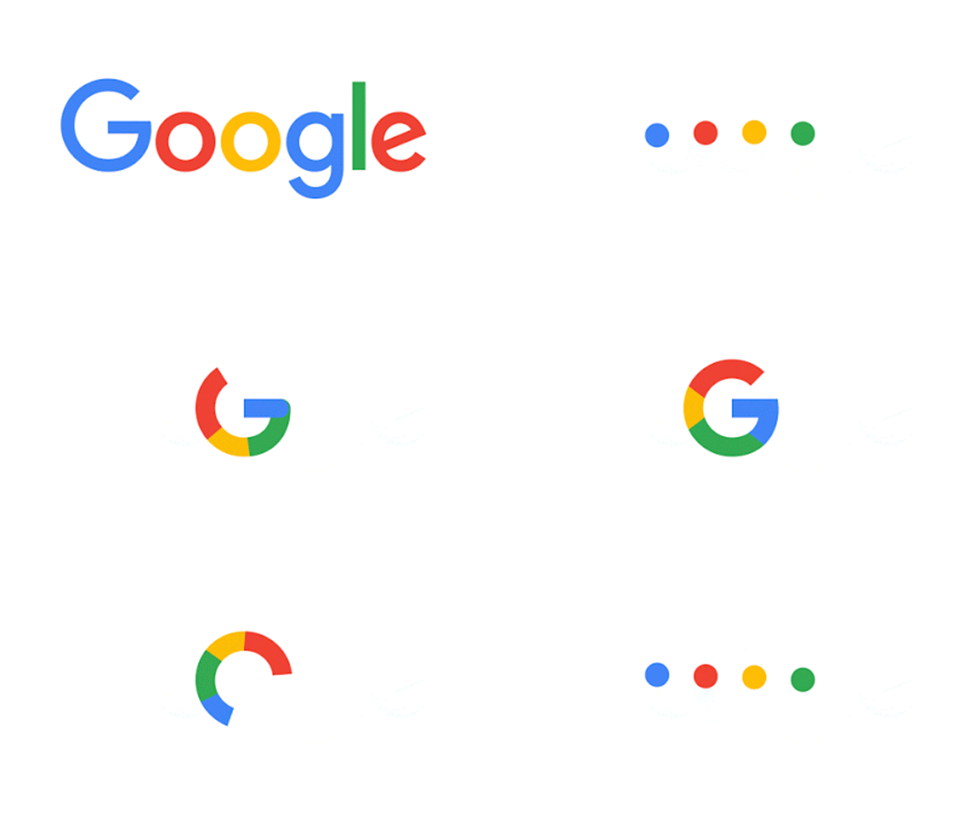
Google has been part of our vocabularies for the past 17 years and we can all identify with the 4 colours that appears on the homepage of our browser everyday — blue, red, yellow, and green. Google has taken that and revamped their iconic logo into a new sans serif font, making it more pleasing to read in digital format.
The logo also uses the iconic colours to show it’s users when it is working for them such as when it is given a voice instruction. And while we’re all familiar with the little white ‘g’ in a blue box, that has now replaced it with a ‘G’ using the four colours that represent Google. Everything is now being splashed with these four colours, even the Google Voice icon, making their presence more identifiable.
According to Google, this isn’t the first time they have changed their look and it probably won’t be the last. But for now, we think that they’ve done a marvellous job and we are surely enjoying their new look and the little animated video that greeted us in our browsers this morning!
| SHARE THE STORY | |
| Explore More |


