

It’s no secret that humans are naturally attracted to all things shiny—you might not like the glitter and shine, but you can’t deny that it is eye-catching—which is why Pantone has recently released Pantone Metallics, a collection of 655 metallic colours especially for printed materials to help make designs “shine, dazzle, and attract attention!”. Seeing how Rose Gold is such a universal hue at the moment, whether it is in technology or jewellery, it perhaps comes as no surprise that it helped formulate over 25% of Pantone’s new trend-driven colours.
“With their sheen and sparkle, metallic shades instantly capture and captivate the eye, adding visual texture and differentiation from surrounding products on-shelf,” commented Laurie Pressman, Vice-President of Pantone Color Institute. “Entranced by luminosity, iridescence, and holographic effects, our love for metallic and pearlescent finishes continues to build, particularly in packaging design. To address this growing trend, our new metallic palette for print encompasses a range of core metal shades including cool and chic silvers, lustrous golds, earthy bronzes as well as a wide variety of colored metal tones that take their cue from fashion and lifestyle including; vivid reds, bold pinks, minty greens, watery teals and warming corals.”

Yes, even coral gets the metallic treatment—Living Coral is the Pantone’s It hue of 2019 after all.
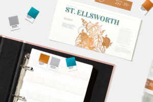
Need a little inspiration on designing with Pantone Metallics? Stay tuned to the colour authority’s four-part metallic trend forecasts. The first combination is already available here. Named ‘Artful Simplicity’, it features a beautiful blend of teal, grey and coppery gold l that exudes timeless elegance.
For more information on Pantone Metallics, head to the website.
| SHARE THE STORY | |
| Explore More |


