Everything about Rimowa is iconic. Its history as a suitcase maker is an exemplary testament of heritage. Ripples, however, are surfacing for the German brand in light of the digital age and they’re headed in a good direction. It’s been a year since the LVMH Group took it under its wing—a move spearheaded by a loyal customer and believer of the brand: Alexandre Arnault, the current head of Rimowa and the 25-year-old son of Bernard Arnault, CEO of LVMH.
![]()
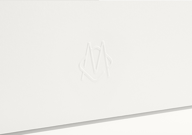
The younger Arnault has a clear vision of where he wishes to take the brand and one of the major steps he’s taken is giving it a new visual identity in celebration of its upcoming 120th anniversary. He told Wallpaper that the logo has served its purpose well “but it has lived its time”. The refresh will see a newly developed Rimowa logo, monogram, visual language, and packaging suite.
![]()
The blue colour is gone and so is the pill shape. The font is now a refined utilitarian sans serif typeface—to represent the functional luxury found in Rimowa’s suitcases. The colour palette now consists of black, white and grey—to represent the brand’s longstanding belief that less is more, as well as the original aluminium suitcase. And a modular pattern system has been derived from Rimowa’s hallmark grooved pattern to be subtly embossed on the owner’s manual, hang tags and even be watermarked on paper stocks—a reference to the considered tactility of the brand’s products and materials.
Rimowa’s new visual identity will roll out globally on their brand communications and channels starting Jan 18, and will be incorporated in all new products later in the year.
| SHARE THE STORY | |
| Explore More |